These Settings apply to Chart and Seasonal windows.

General
- Show Tool Tip – will show a pop-up identifier as the mouse passes over chart objects such as graph lines, trend lines, and study lines
- Show Data Window – adds a quote window to each new chart window opened
- Show Crosshair window – will display a pop-up display for each data point when you have crosshairs activated.
- Fit data to window – Allows you to more data into a chart window.
- Use price format of linked source – when linking the chart between displays keep the formatting consistent with the source of the data – for example, if the quote sheet has 3 decimal places, when it’s linked to the chart the chart will also show 3 decimal places.
- Persistent line study creation – When Adding a line study, such as a diagonal trendline, if this selection is check, it will leave the line study activated so you can do another one right afterward without reselecting it. Ex: you might want to duplicate a trendline. If unchecked, the line study will be deactivated immediately after you create it.
- Use line chart w/ single point data –
- Show Sync Points –
- Show Data Points on Line Charts – When this is turned on, when the tick interval is also selected on the chart, only the trades will have a ‘dot’ drawn as a data point.
Data Handling
Select how you would like day, minute and tick data to be handle for certain situations such as holidays or session hours. This can apply to either Charts or Quote Sheet displays.
Intraday Time Zone
Select the time zone you want represented on the x-axis of charts
- Local – Your local time
- GMT – Greenwich Mean Time
- Exchange – local time at the exchange providing the data
Default Chart
Type – Select one of the chart types (Bar, Line, Candlestick, etc.) listed. This selection determines the default chart type displayed.
Interval – Select one of the intervals (Tick, Minute, Daily, etc.) listed. This selection determines the default time intervals displayed on the x-axis.
- For Second, Minute, and Daily intervals, you can also select the Compression setting of 1, 5, or 10 intervals per bar.
Crosshairs
Select how you would like the crosshairs on your charts to display.
Data Window
These entries allow you to select what you want to display in the data window and how to display it.
- Show – Select the fields to display in the Data window.
- Field Format – In the data window, this selection will display all the fields on one line or an individual line for each field.
- Field Order – Specify the order of the data shown in the data window.
- Custom Field
- The Custom Field entry allows you to add additional information into the data window.
- Select the field by clicking on Change
- Check mark Custom Fields in the Data Window Show: entry to the left.
- When you open a new chart the information from that field will be display under the chart symbol
- Font – Customize the Data Window Font
Chart Colors Setting
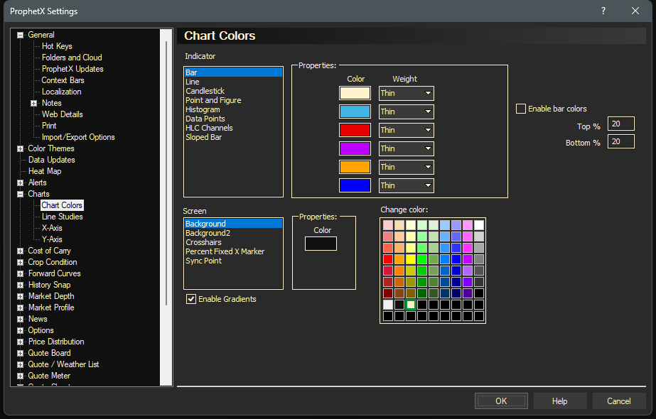
The steps below will explain how to change colors, weights, and style of a Chart or Study in a Chart window.
- Click on the plus sign to expand the Charts, select Colors.
- Customize what colors you would like to use for all sections of your charts.
- To apply your changes and exit, click OK.

Line Studies Setting
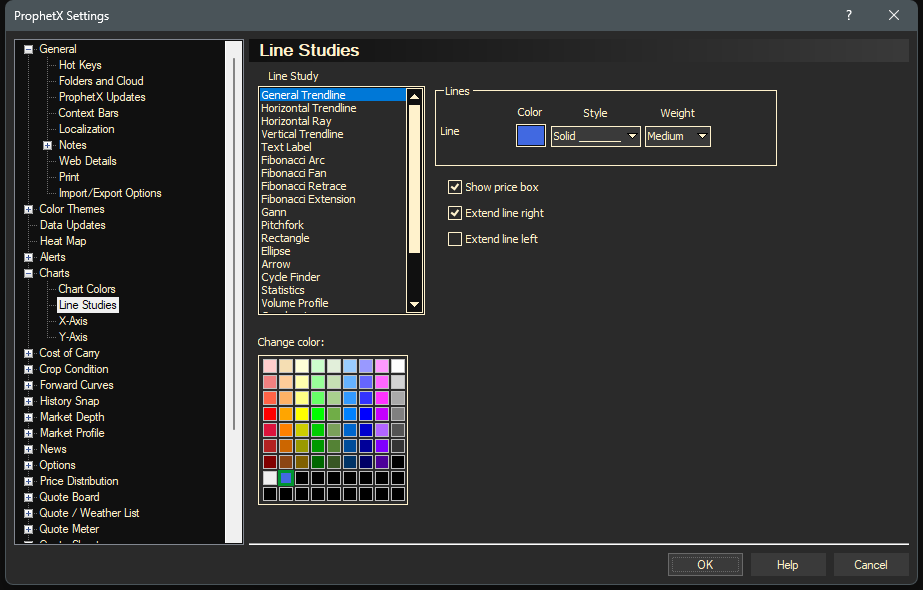
The steps below will explain how to change colors, weights, and style of a Line Study in a Chart window.
- Click on the plus sign to expand the Charts, select Line Studies.
- Select a Line Study, Color, Weight, and Style.
- To apply your changes and exit, click OK.

X-Axis Settings

Grid
- Interval Lines – sets the Weight and Style for vertical chart intervals on intraday charts
- Day/Session Lines – Solid vertical grid lines denote start of new days and sessions in minute charts.
- Background – Click on the Background Color box and select a color from the grid of colors
- Text – Select the color of the X-Axis Text
- Weight – Click the Weight pull-down menu and select a weight
- Style – Click the Style pull-down menu and select a style
- Show – Click on the Show box to turn Interval Lines and Day/Session grid lines on or of.
- Color – Click on a color from the grid of colors
Format
- Automatically format labels – will set the date and time format to the system defaults
- Date format – Change this to determine how you want dates displayed on the x-axis.
- Time format – Change this for how you want the time displayed on the x-axis.
- Font – Click the Font… button to change font, style, and size of text.
- Lock Scrollbar – locks a scrollbar into place that can be used to scroll the chart back/forward.
- Right margin bars – allows the charts right-side margin to be increased so that future dates are visible. Trend lines can be extended into this area. Allowable range is from 0 – 50.
Y-Axis Settings

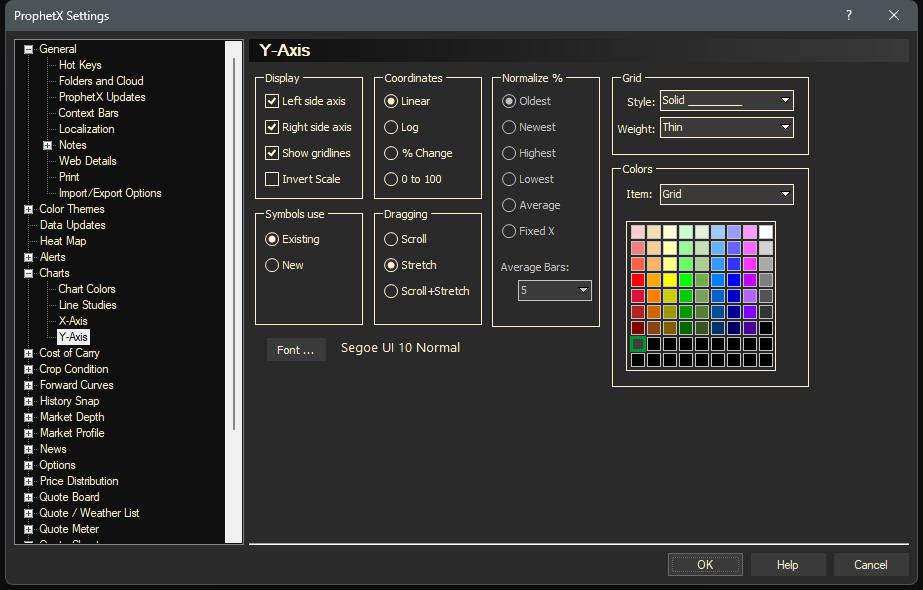
Display
- Left hand side axis – turn the left hand side axis on or off
- Right hand side axis – turn the right hand side axis on or off
- Show gridlines – turn grid line display on or off
- Invert Scale – turn the Invert Scale on or off
Symbols Use
- Existing – when a new symbol is added to a chart with either [CTRL]+[ENTER] or [CTRL]+Drag/Drop, it is added to the Existing Y-Axis.
- New – when a new symbol is added to a chart with either [CTRL]+[ENTER] or [CTRL]+Drag/Drop, it is added to a new Y-Axis.
Coordinates
- Linear: select for a standard linear Y-scale – the default selection
- Log: select for a logarithmic Y-scale.
- % Change: select for a % Change Y-scale. When this is selected, the different “Normalize %” options become active.
- 0 to 100: select for a 0-100 Y-scale. The highest value in the displayed chart will become 100, and the lowest will become 0.
Dragging
- Scroll – When in Scroll mode, dragging the scale will simply move the scale up or down, maintaining the spacing.
- Stretch – When in Stretch mode, you can drag the upper or lower part of the scale towards or away from the center, condensing or expanding it.
- Scroll + Stretch – Select to do both Scroll and Stretch
Normalize %
These items becomes active when the “% Change” Coordinates are selected.
- Oldest: prices are normalized to 0% from the oldest price on the current chart.
- Newest: prices are normalized to 0% from the newest price on the current chart.
- Highest: prices are normalized to 0% from the highest price on the current chart.
- Lowest: prices are normalized to 0% from the lowest price on the current chart.
- Average: prices are normalized to 0% from the average price on the current chart.
- Fixed X: a “normalize” vertical line will appear on the chart. Drag to any price on the chart and the prices will be normalized to 0% at the lines current location. The width of the bar is determined by the “Average Bars” setting.
- Average Bars: allows the selected number of periods to be averaged for the Normalize % settings.
Grid
- Style – select a grid style
- Weight – select a weight
- Color – select a color from the grid of colors
Font
- Set the Y-Axis font.