Data Maps
- With the Data Maps tool, information such as DTN Cash Grain data can be visualized on an interactive map, allowing a user to zoom in/out to different levels of detail and interact with the data geospatially.
- Multiple USDA NASS reports are also available layers
DTN Cash Grain Data
- DTN collects cash bid data for 25+ crops, from 4000+ grain buying locations across the United States and Canada daily. These bids are available via DTN ProphetX via unique ticker symbols by facility/commodity/delivery period, and will have both flat price and basis symbols when applicable. These symbols can then be leveraged in different displays for monitoring, comparison, and charting of historical data.
- For multiple commodities, DTN also normalizes bids to create aggregated averages by county and USDA Crop Reporting Districts.
To Display a Data Map:
- Select Layered Maps/Data Maps from the Main Menu Bar
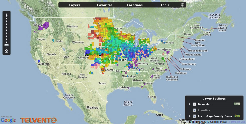
- Make selections for what to display in the maps by clicking on Layers at the top of the map
- The zoom control on the left allows you to zoom in or out to see more or less detailed information.
Map Layers
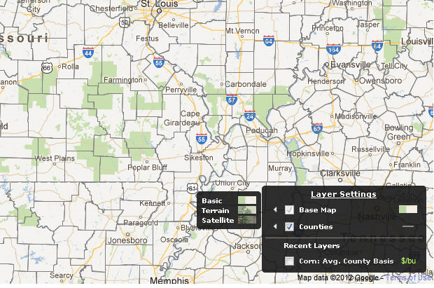
Select how you want the base map displayed by checking off the appropriate information.
Notice the “legend” to the right of these selections that shows how they will be displayed.
The map below is showing county lines and cities within those counties.
When you hover over the “legend” buttons a pop-up will displays showing various selections or legends that represent what the data in the map means.
Corn
This section is exclusive to information on Corn, just as the following selections are exclusive to their respective products. The last selection is for Precipitation Impact, current, and yesterday/overnight rainfall. The data used in these examples was taken from a test database and do not reflect accurate or current readings.
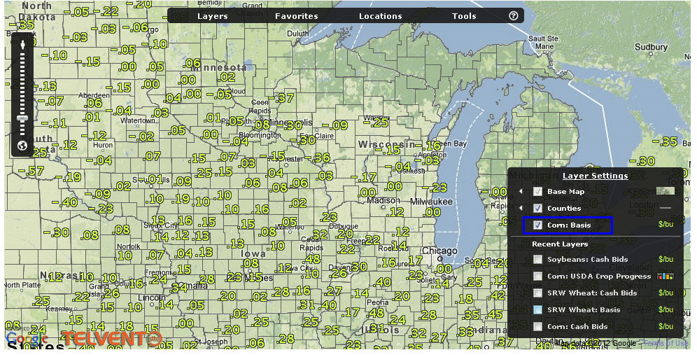
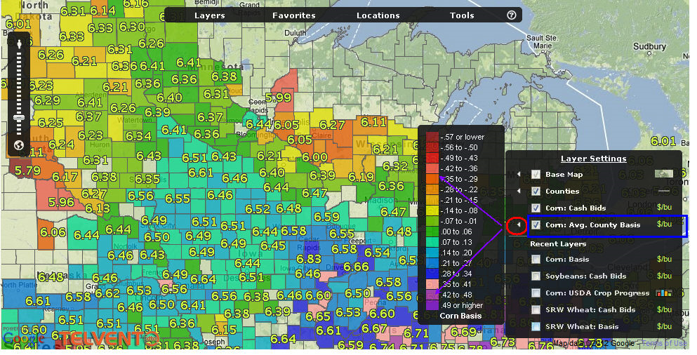
The map below shows corn basis prices for all the reporting locations in the midwest.
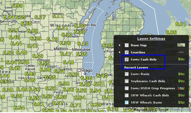
Ex: This map shows the cash bids at reporting locations, based on dollar per bushel.
Ex: This map displays the Basis price by location as well as color coded Average County Basis
Ex: This map shows the current crop progress. The color coding is displayed on the right when you click on the color legend
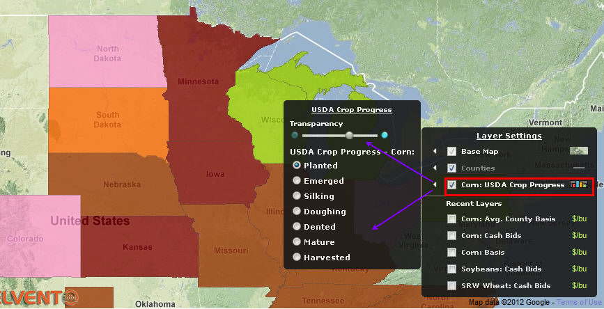
This map shows USDA Corn Crop Progress. Color coding is indicated by the legend to the right of the selection USDA crop conditions.
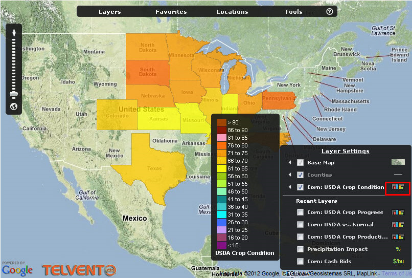
The USDA Crop Production displays by state with the estimated and projected production and yield in the legend at the right
The map layers for the other commodities are the same as those shown above.
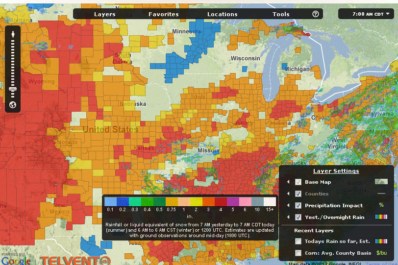
Precipitation
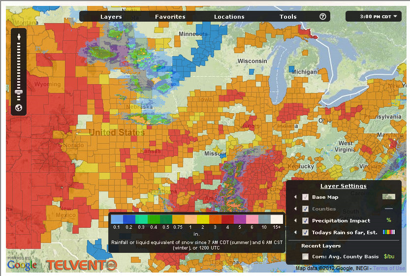
The Precipitation selections indicate current precipitation conditions, today’s estimated rainfall so far, and yesterday’s/overnight rainfall.
Legends at the right reference the map’s colors.
Once your layers are selected, save them as your Favorites:
- Hover over the top portion of the map and select Favorites
- Enter a unique name in the Create New Favorite dialog and click on save.
When you want to look at a map, whether it’s a data map or a weather map, hover over the top of the map and select your “Favorite” from the list.
Base (Default) Maps
You can set up your default maps with the information you prefer and then “refresh” it so that it will always display that way when you open the base map.
To refresh:
- Right click in the white area somewhere around the perimeter of the map graphic
- Select Refresh